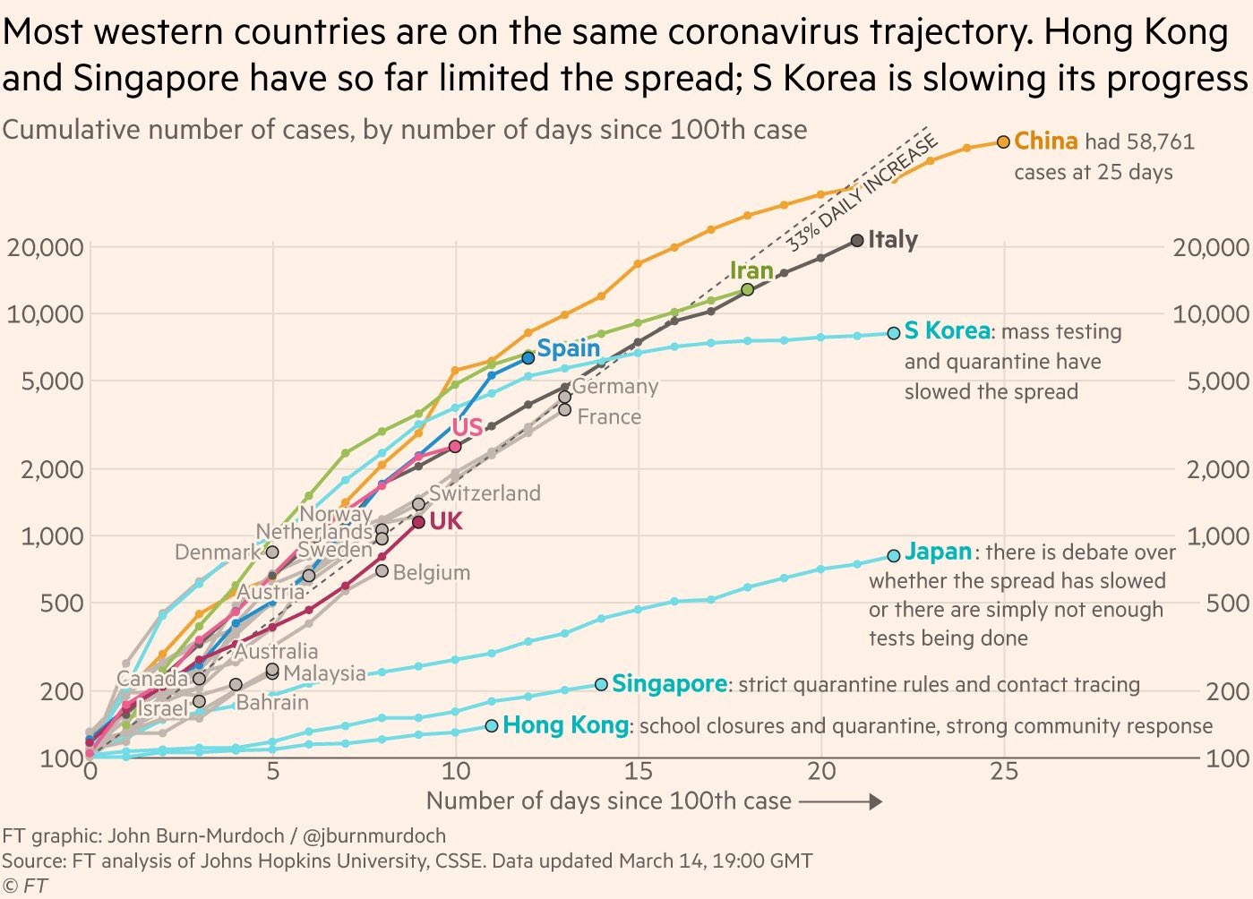
Here's a chart from March 14 showing how things are progressing by country - it's pretty uneven, which suggests that how we respond matters (and arguably social distancing works).
NOTE: the y-axis is basically a log-scale, so if a curve appears linear, it's really exponentially increasing.

